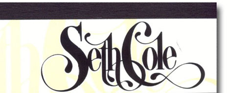
Yesterday in my screen printing class, I came across a pad of paper lying on the table. I stopped dead in my tracks looking at the gorgeous typography on the cover. I tried to see if I could somehow take the cover without anyone minding, but I was good and found this image online instead. This company is decades old, yet the type is so lovely and classic. Makes me wish my name was Seth Cole so I could justify staring at this all day…

Beautiful.
That is lovely.
Reminds me of the work of Marian Bantjes, if you haven’t heard of her already! http://www.bantjes.com/
Gorgeous!